Mastering Mobile-First Design: Best Practices for 2024
WEB DEV
CSS
HTML
Aug. 10, 2024
As we move further into 2024, mobile-first design has become a crucial strategy for web development. With the majority of users accessing the web via mobile devices, it's essential to prioritize mobile usability. This article delves into the best practices for mastering mobile-first design in 2024.
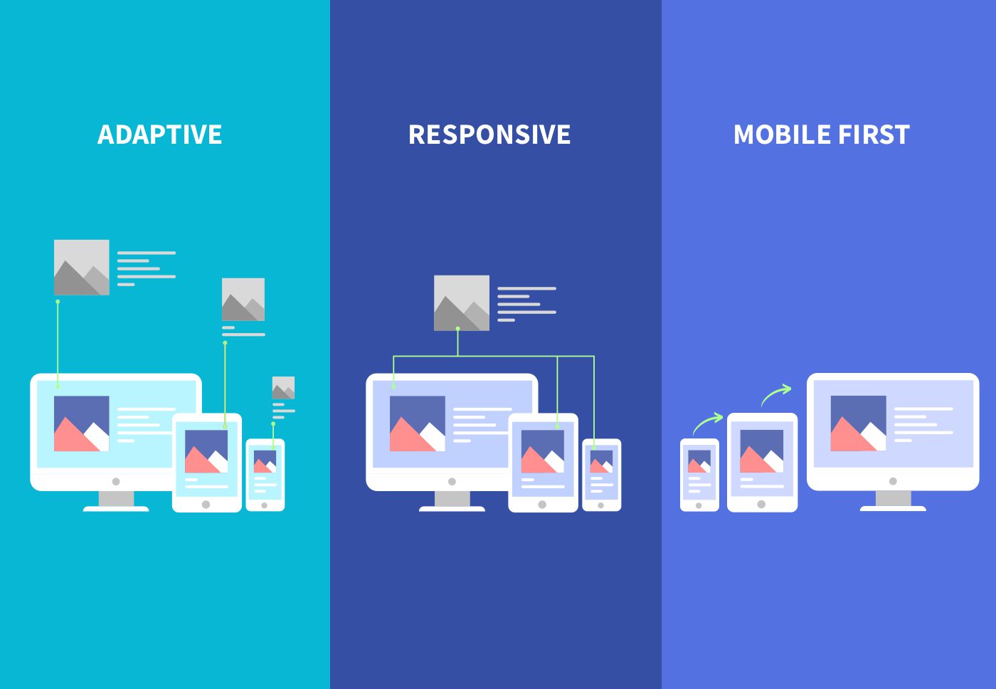
Understanding Mobile-First Design
Mobile-first design is a development approach where designing for the smallest screen sizes takes priority. This ensures that users have a seamless experience, regardless of the device they use. By focusing on mobile first, you build a foundation that scales up to larger devices, rather than trying to shrink a desktop experience down.
Why Mobile-First Design Matters
The Shift in User Behavior
Over the past few years, mobile internet usage has surpassed desktop usage. This shift in user behavior means that websites need to be optimized for mobile devices first to ensure a positive user experience. A mobile-first approach not only caters to the majority of users but also improves your site’s SEO, as search engines favor mobile-friendly websites.
Key Elements of Mobile-First Design
1. Simplified Navigation
Navigation on mobile devices should be intuitive and easy to use. Simplified menus, collapsible sections, and thumb-friendly buttons are essential. Ensure that users can find what they need without excessive scrolling or tapping.
2. Optimized Images and Media
// Example of using responsive images
<picture>
  <source
    srcSet="path-to-small-image.jpg"
    media="(max-width: 600px)"
  />
  <img
    src="path-to-large-image.jpg"
    alt="Optimized Image"
  />
</picture>
Images and media should be optimized for different screen sizes. Utilize responsive images to deliver the best quality based on the user's device. This not only enhances the user experience but also improves load times, which is critical for mobile users.
3. Prioritize Performance
Mobile users expect fast loading times, and performance is key to retaining visitors. Minimize the use of heavy scripts, reduce server response times, and enable lazy loading for images. Every second counts, and slow sites can lead to high bounce rates.
Best Practices for Mobile-First Design in 2024
1. Embrace Progressive Enhancement
Progressive enhancement is a strategy where the most essential functionalities are built first, ensuring they work on the smallest screens with the simplest technologies. Advanced features are added as the screen size increases, providing a richer experience for users with more capable devices.
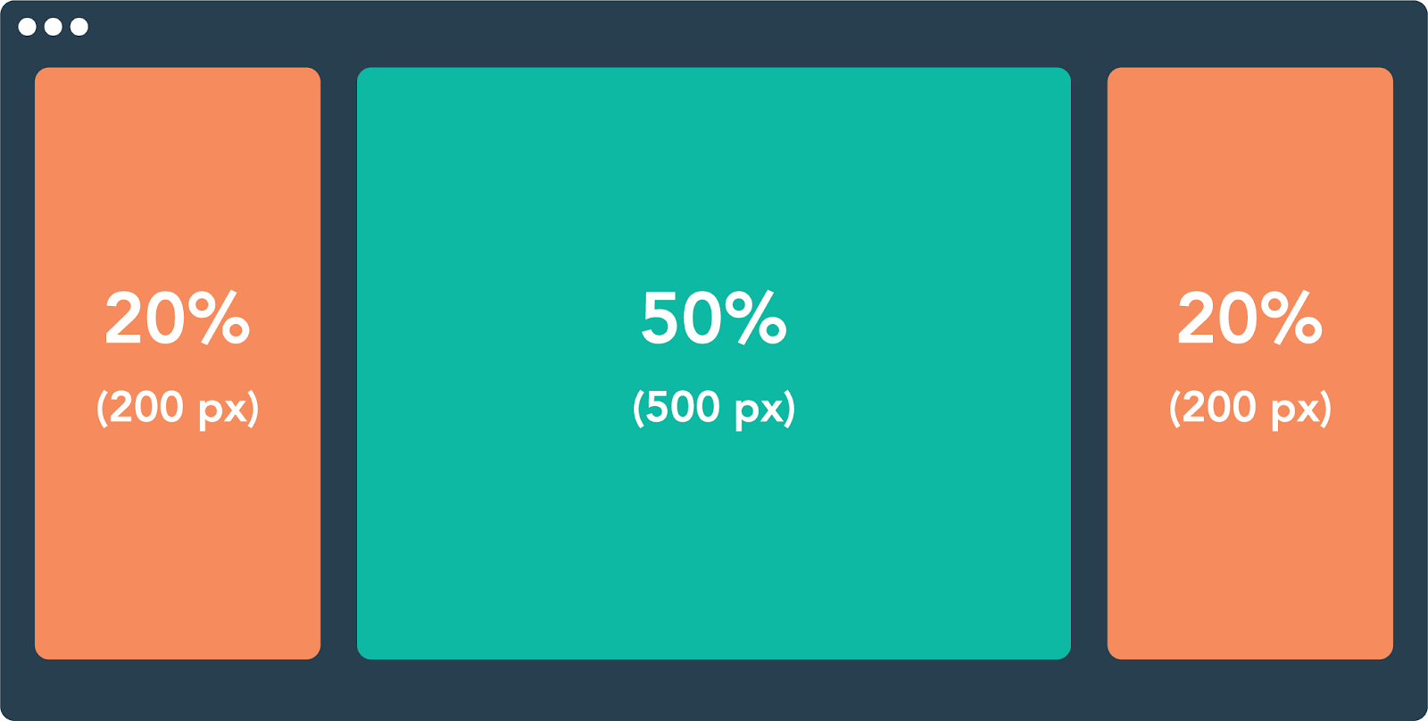
2. Use Fluid Layouts
Fluid layouts are vital in mobile-first design, as they allow your content to adapt to various screen sizes. Avoid fixed-width layouts and instead use percentage-based widths, flexible grids, and media queries to ensure your design is responsive.
3. Optimize Forms for Mobile
Forms are often a point of friction on mobile devices. Simplify forms by minimizing the number of fields, using auto-fill and input masks, and ensuring that the form fields are large enough for easy tapping. Provide clear labels and feedback to guide users through the process.
Testing and Iteration
The Importance of Testing
Testing is a crucial part of the mobile-first design process. Regularly test your website on a variety of devices and screen sizes to ensure a consistent and positive user experience. Use tools like Google's Mobile Friendly Test and real device testing platforms to identify and fix any issues.
Iterate Based on User Feedback
User feedback is invaluable in the design process. Continuously gather feedback from your users and iterate on your design to address any pain points. This iterative process will help you refine your mobile-first design and ensure it meets user needs.
Conclusion
Mastering mobile-first design is essential for success in 2024. By focusing on simplified navigation, optimized media, and performance, embracing best practices like progressive enhancement and fluid layouts, and continuously testing and iterating, you can create a mobile-first website that delivers an exceptional user experience across all devices. Stay ahead of the curve and make mobile-first design a priority in your web development strategy.